Creating this chic city apartment for my latest design client was a dream come true. Not only because she was so lovely, but because she trusted me implicitly to execute my vision.
It makes such a difference when clients give into the design process. When there’s trust there, and when they’re open to new ideas, magic can happen. It was certainly the case for my Melbourne CBD client, who uses this apartment as a weekender when she’s in town.
From the moment we met, she was on-board with my ideas; to take what was a darker, heavy space and transform it into a light-filled escape. Something that felt chic and modern, but with a feminine sense of timelessness. I’m so happy with this result for a number of reasons. But mainly because I got to make some dramatic changes and the difference is major.
Let me walk you through the three main areas I rejuvenated in this apartment, and I’ll share some tips and product suppliers along the way.
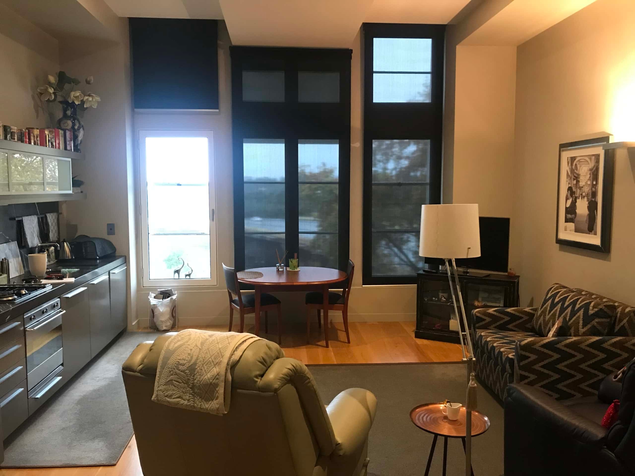
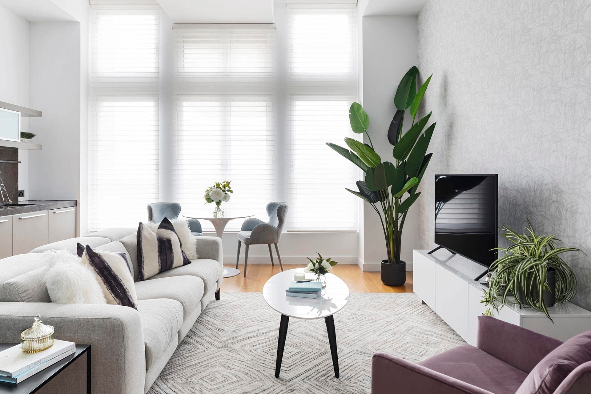
Above and Below: Living room before and after
A Chic City Apartment, with Feminine Vibes
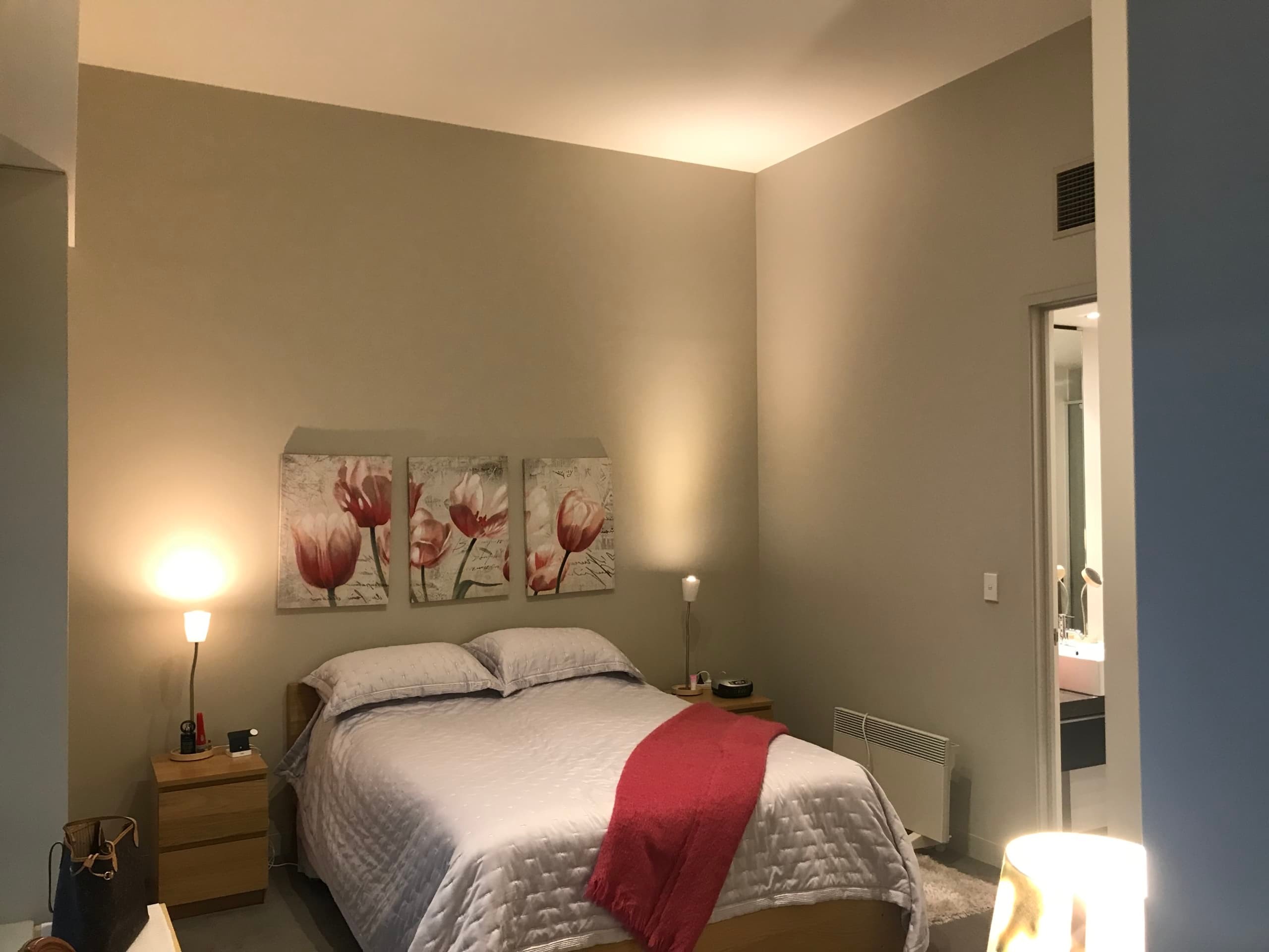
The brief from the client initially was to lighten it up. All the walls were grey, and some almost black. Now, I’m no stranger to a dramatic wall colour (I did a killer one in my Camberwell project). But this apartment is modest in size and the dark colours were sucking the life out of it. So I knew from the get-go we’d go all white on the walls.
There wasn’t an obvious theme here, which Im really happy about. A good design always calls on a number of aesthetics and this apartment certainly does. There’s a bit of Scandi in there, a little luxe, a nod to art deco and even a dash of Hamptons. I love that it was more about vibe, and the right medley of colours, more so than sticking to a strict theme. And the client was pleased with that approach too.
Of course, all white walls weren’t going to give this apartment personality. And so I threw out the idea of wallpaper. To my absolute delight, the client was a fan. I knew right there and then we’d end up with a good result, because I’m so obsessed with what wallpaper can do to a space, and the client trusted me to execute it.
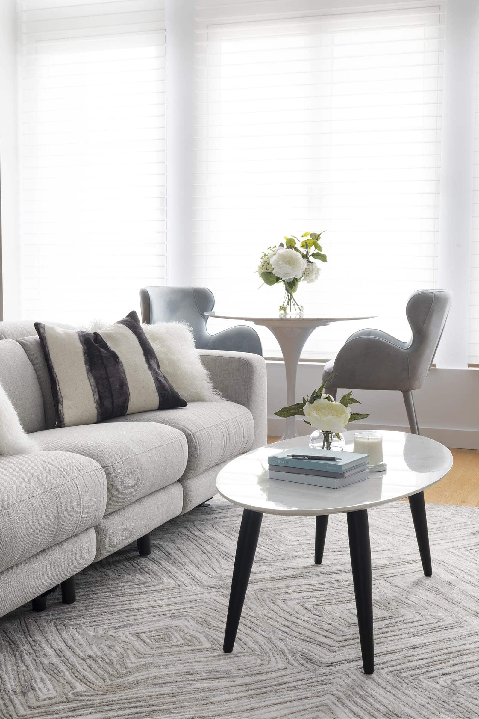
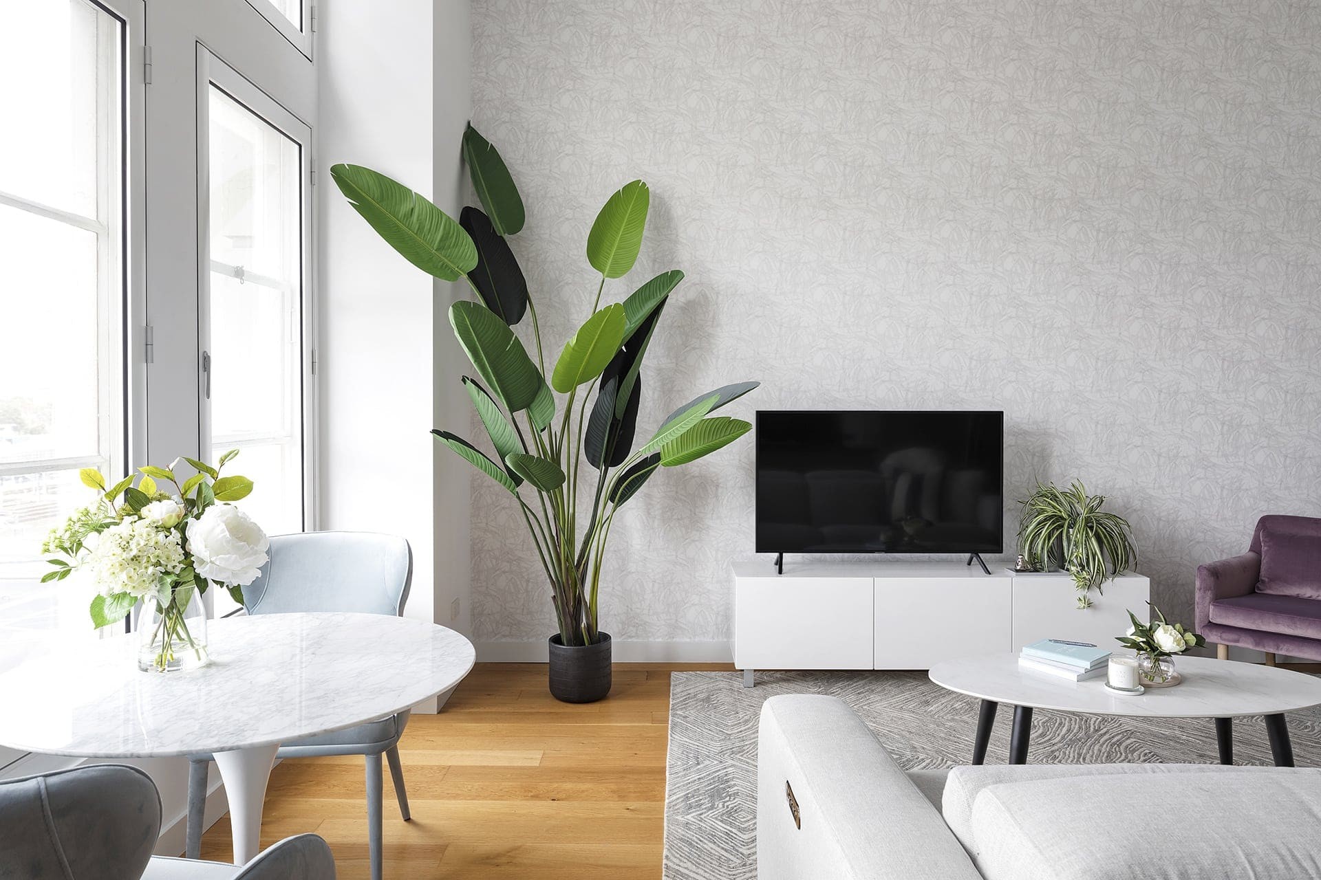
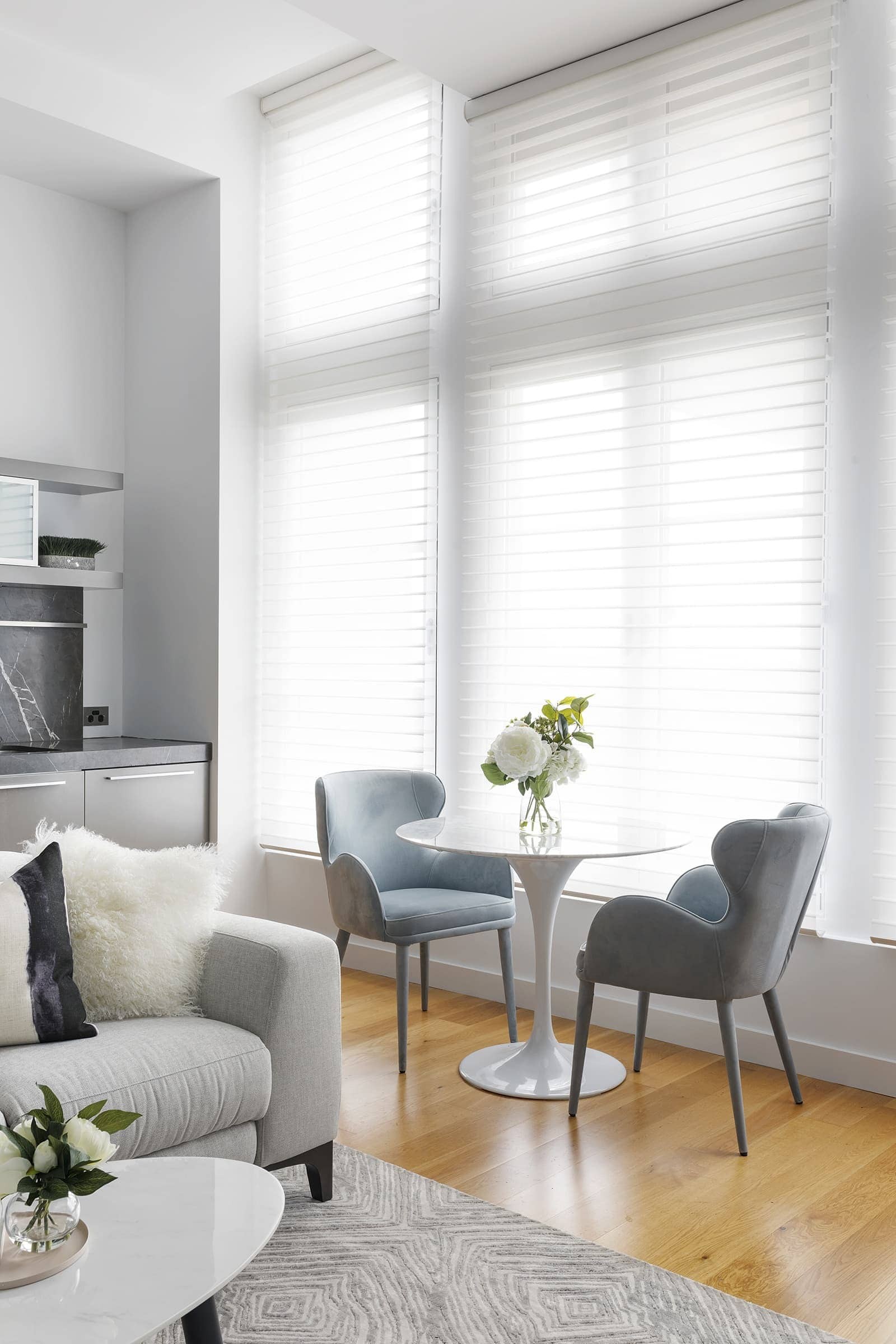
The wallpaper in this living room, for example, is a stunner from Milton & King, and it elevates the room so much. Imagine if that wall was just white. There would be nowhere near as much impact. I also love the round tulip dining table and those powder blue dining chairs from Globewest. So comfy, so chic.
A calm, light-filled space doesn’t mean you have to resign yourself to white walls. The soft wallpaper and rug patterns do a lot of work in ensuring this room feels interesting but not overbearing.
Function was Important, as was Spatial Planning
Smaller rooms call for some major spatial planning, and in this chic city apartment it was quite crucial. It’s not that the space is tiny, don’t get me wrong. It’s more that we needed to fit in a living zone as well as a dining space by the window. And so ensuring you can still move through the room was important. I didn’t want it to feel cramped, but I didn’t want to have furniture that felt too dwarfed in the space either.
I decided to focus on the living zone as the main stage in the space, and give the client a dining table moment to the side. The reality is, this is a weekender; cooking and having friends over is less vital here. It was more about being comfortable, watching TV, kicking back and putting your feet up on a divine sofa. So the dining nook is gorgeous, but not the main focus.
A Sofa to Kick Back in, Of Course!
And speaking of a divine sofa, that was an important consideration here, because the client had recliner armchairs before. And she was keen on recliners again. Good-looking recliners can be tough to find, but this one from Plush ticked all the boxes. It’s a three-seater sofa with a recline at either end. So when she and hubby are in town, they both have a spot in front of the tele.
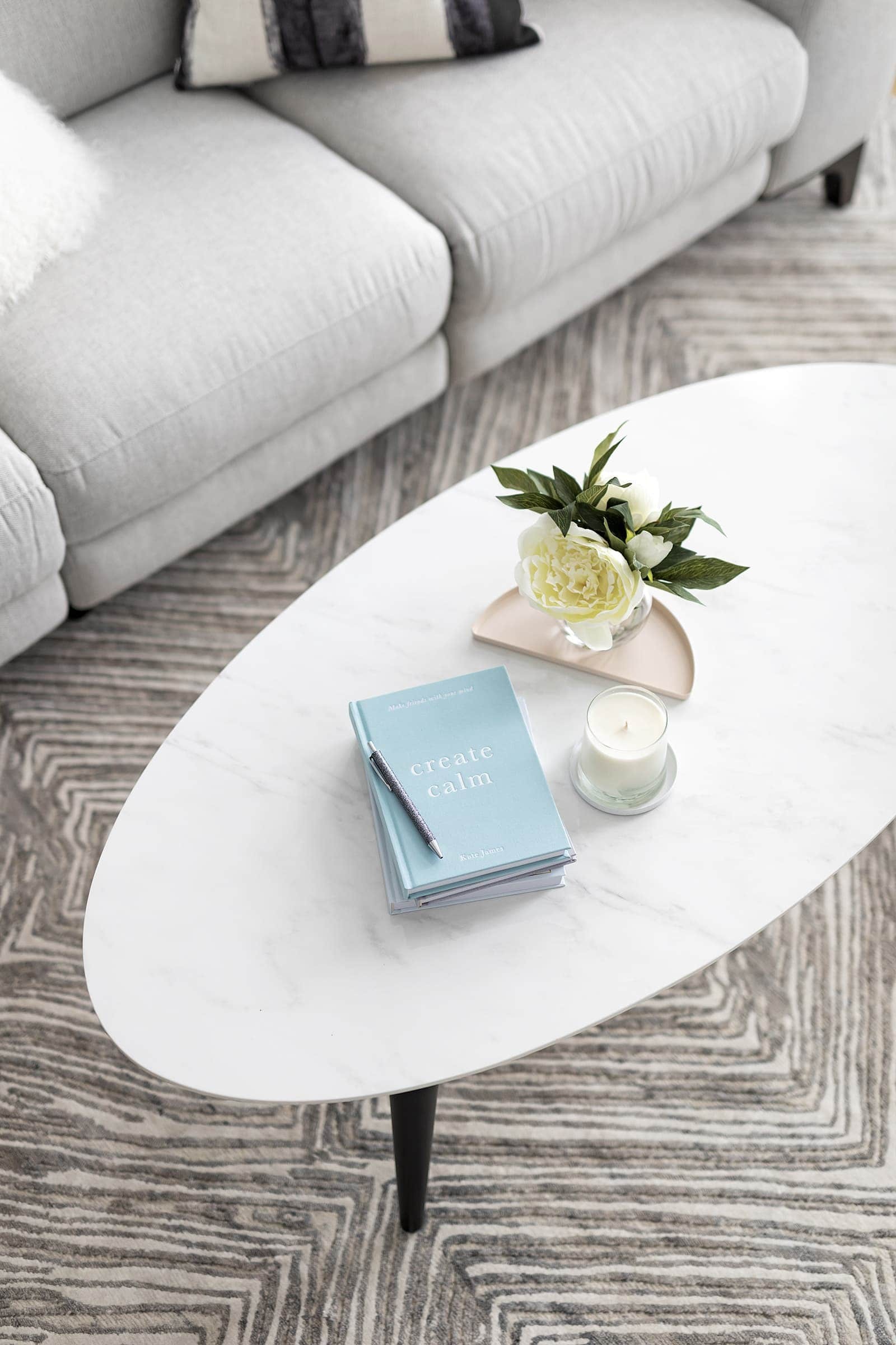
And can we talk about the stunning rug from Bayliss? So so chic, and it speaks perfectly to the shapes in the wallpaper I got installed in the bedroom. Bonus points go to the cheap-as-chips coffee table I got from Fantastic Furniture. See, bargains can be mixed in with designer finds if you have an eye for blending them in.
Lastly, on the topic of addressing function, I installed divine silhouette shades on the living room window. Previously, it had black roller blinds and they just dragged the space down so much.
Creating Calm through Colour
A calm, light-filled space doesn’t mean you have to resign yourself to white walls. The soft wallpaper and rug patterns do a lot of work in ensuring this room feels interesting but not overbearing. The soft grey tones certainly add a bit of punch, but there is colour in this apartment in other areas too.
I knew from the start of the project that accent colours would be soft blues and powdery violets. The client actually had a beautiful indigenous artwork she wanted to hang somewhere in the property and it was the launching pad for the whole scheme. I actually love when something like this is included as a ‘must include’ because then the end result is super-reflective of the people who live in the space. I hung the artwork in the hallway, which sadly was too narrow to photograph, but the artwork is there, I promise you!
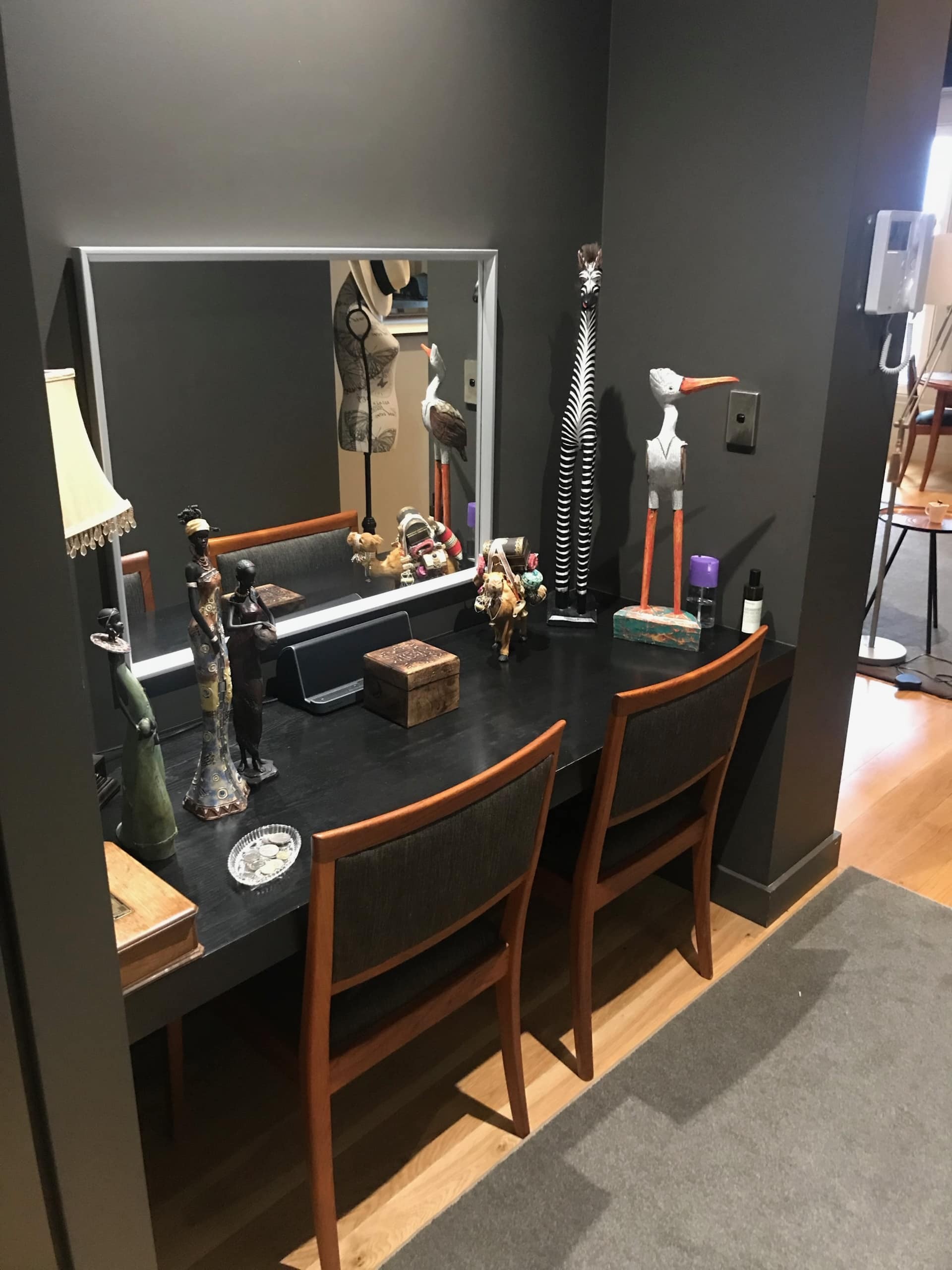
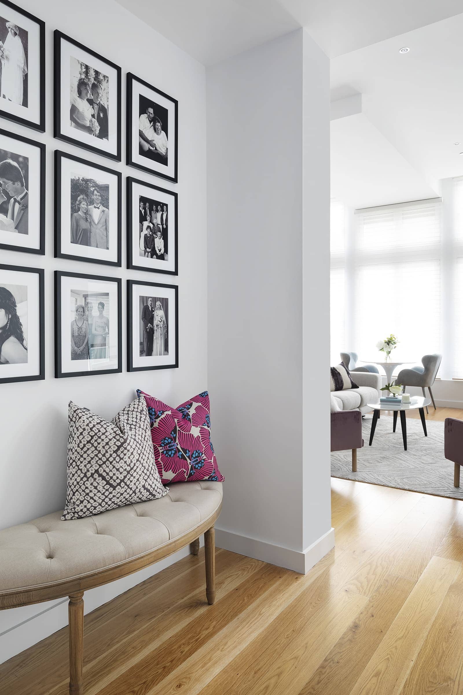
Outside of the pastel tones in pieces like armchairs, dining chairs and bedding further down, greenery was used in places. Yes, of course the plants are fake (you know I’m obsessed with them). Then, to keep the space feeling contemporary and not too soft, black acted as a moment of punctuation in rooms. Below, for example, we did a nine-grid of family photos in the entryway where an old desk used to be. I’m super-pleased with how this little nook turned out.
Above and Below: Hallway before and after
Above and Below: Bedroom before and after
A Bedroom Fit for a Queen
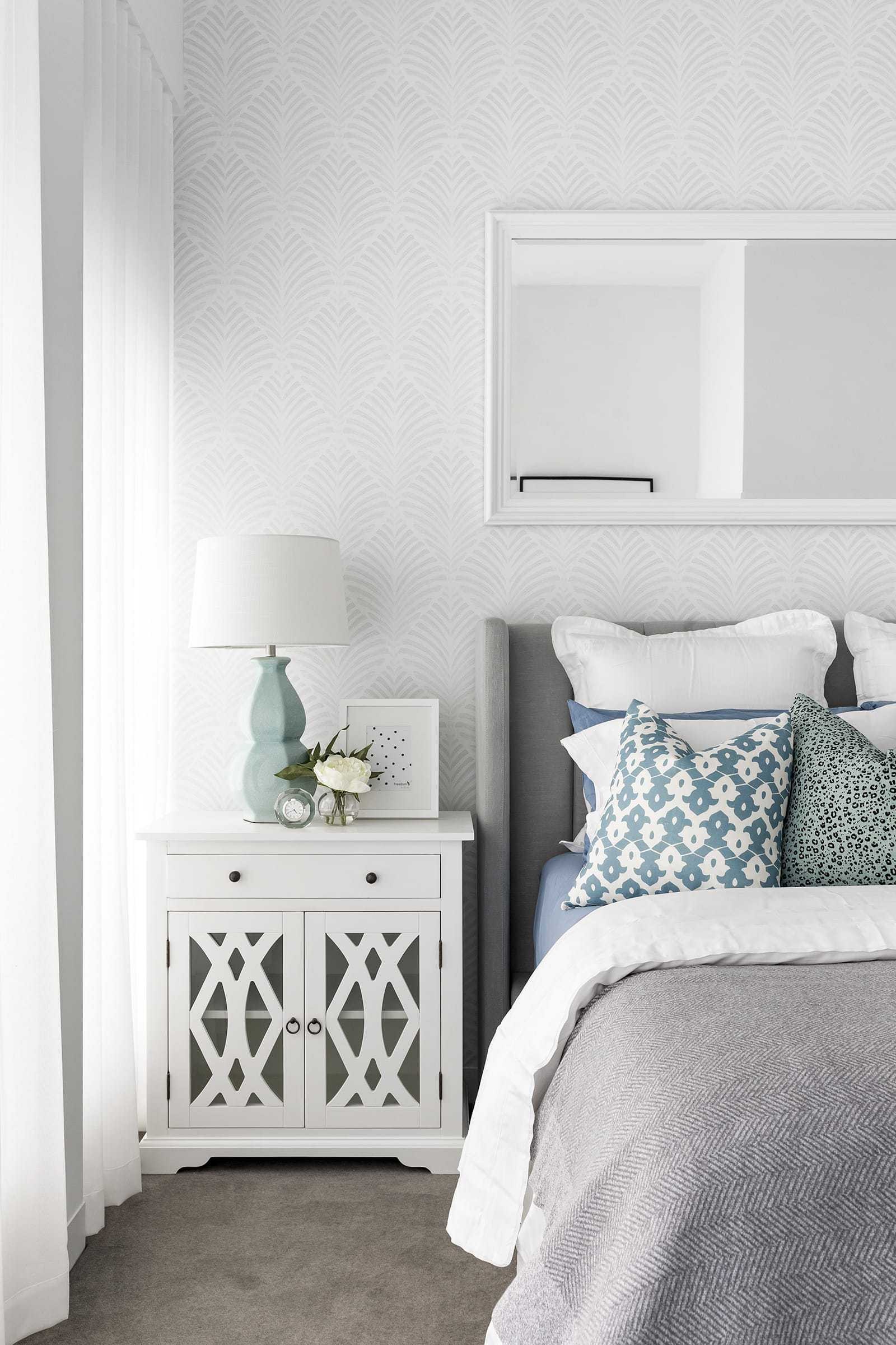
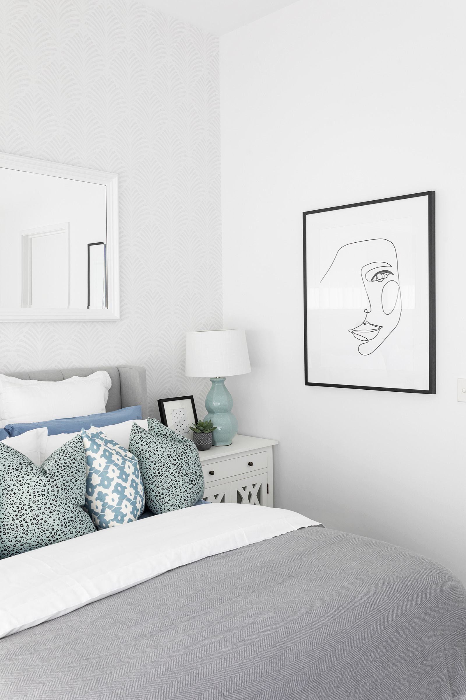
I’m so obsessed with this bedroom I can barely express it in words. From the wallpaper to the bedsides to the mirror and the sheer curtains, it just kinda sings now. Not forgetting the chic wall art I brought in, or the grey upholstered bed (which is gas-lift, from Brosa, and you can store things underneath the frame). It ticks so many boxes and feels effortlessly sophisticated.
Outside of the mattress, everything in this bedroom is new. The wallpaper, again from Milton & King, came first. I knew I wanted a dramatic moment in this room and the wallpaper was it. Notice how the wallpaper design mirrors the pattern on the front of the beside tables? And then the cushions on the bed have a similar shape on them? It’s all about the finer details creating a sense of cohesion.
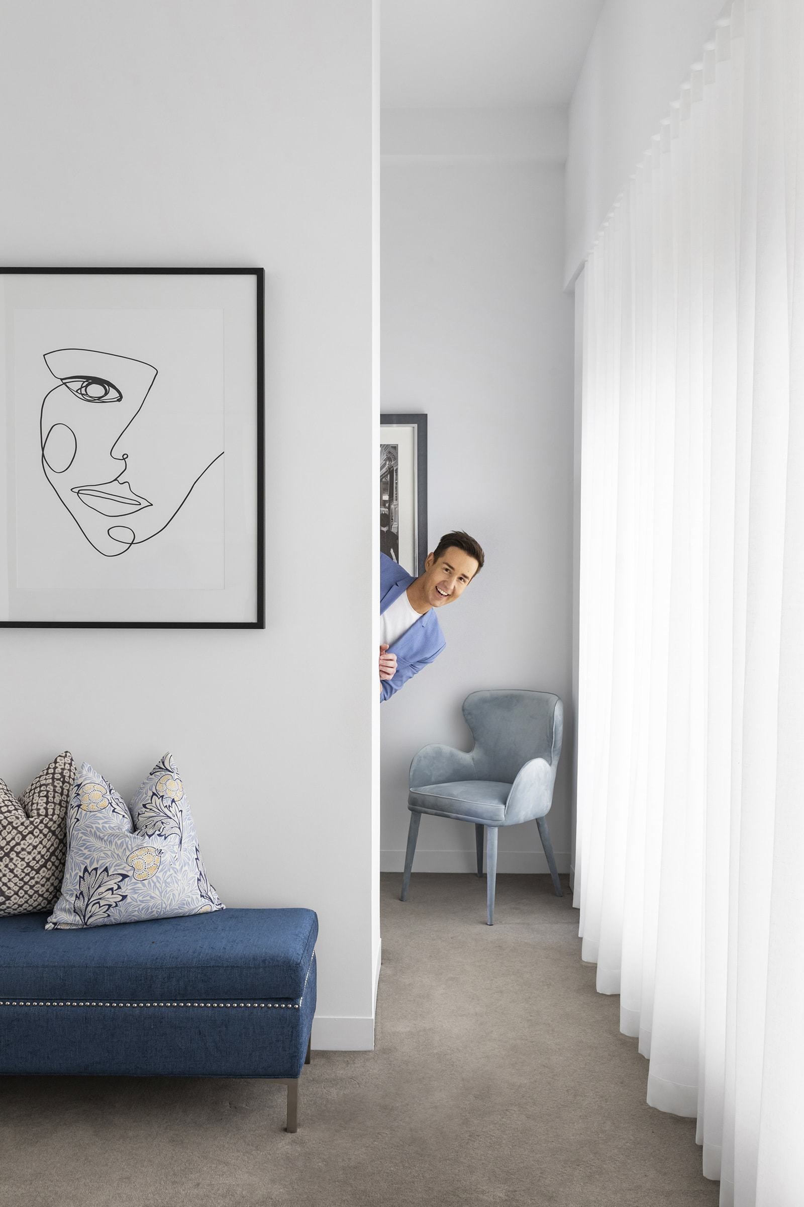
The artworks from LaGrolla were essential in giving the space contrast and drama. The space was very white, so it just needed a little oomph in places. It’s a Melbourne apartment after all, we love black down here! They also speak to the black frames I hung in the hallway, so the different zones in the home all speak to one another stylistically.
Sheer curtains were also key to making this space feel light and ethereal. They’re from my go-to supplier for window treatments, Shades in Hawthorne. Overall I think this bedroom perfectly taps into the chic city apartment vibe I was going for.
“That’s what my design philosophy is all about; mixing investment pieces with more affordable decor finds. I love the result of this inner city escape, and it was done on a really decent budget”.
Mixing the Skimp and the Splurge
This chic city apartment has pieces from Globewest in it, but also items from Kmart. You’d never know where any of it comes from, truthfully, or how much it costs, if I didn’t tell you.
That’s what my design philosophy is all about; mixing investment pieces with more affordable decor finds. I love the result of this city escape, and it was done on a really decent budget. Sure, money had to go into paint, window treatments, wallpaper. The shell of the space has to be right or nothing else is going to work. But then, inside the shell it’s honestly about mixing what works, not worrying about the brand or the price tag.
If you’re wanting some more info on TLC’s interior design service, click here. I go into all the details about how it works and what I charge, so I could be sprinkling some of my design magic on your place before you know it.
And if you have any questions about this makeover, drop them in the comments below and I can sort you out.
Happy decorating!





38 Responses
Skillfuly selected items, well balanced. A sofa that looks that good and reclines would stop a lot form over function tension in our house. Scale of hall ottoman is perfect and the beside tables lovely. Appreciate the eclectic mix of investment vs save. Wish we had same suppliers available in NZ!
Oh thanks so much, you’re too kind. I love me a bit of skimp-meets-splurge!
Just so adorable. Light really makes a big difference & the soft colors! Great style. Really made my day. This design made me smile. Gave me ideas for my place. Thank you.
Thank you!
Hi Chris,
Thank you so much!! This particular post was a such an inspiration for me, can’t thank you enough…If you want drop me a quick line and I’ll share my pics with you, on how influential your work is…
Steve
If you did a design course I would love to know about it, you are amazing
Thanks Julie. You’re too kind. I studied at ISCD in Sydney. They are now a purely online school.
Fabulous Chris! Calm and classy!!!
Thanks Margot!
Every room is gorgeous but I especially love the bedroom! Those side tables are to die for and exactly what I need in my Hampton’s bedroom makeover! So stylish!
Gorg right? Thanks Kim!
Love a good gallery wall Chris
Hey that’s a great idea if Masterchef can get new judges why can’t the block
I could see you on there
My phone still hasn’t rung!
Love love love it!!! I could move in right now 🙂
Where did you find those white bedside tables? The bedroom cushions are gorgeous too! I can never find any cushions that nice! Do you have yours made?
Ingrid x
Thankyou Ingrid!
Bedsides from a trade supplier and the cushions are a mix, some trade, some Adairs, some LM Home. I don’t get them custom made, there are usually options on the market I can find.